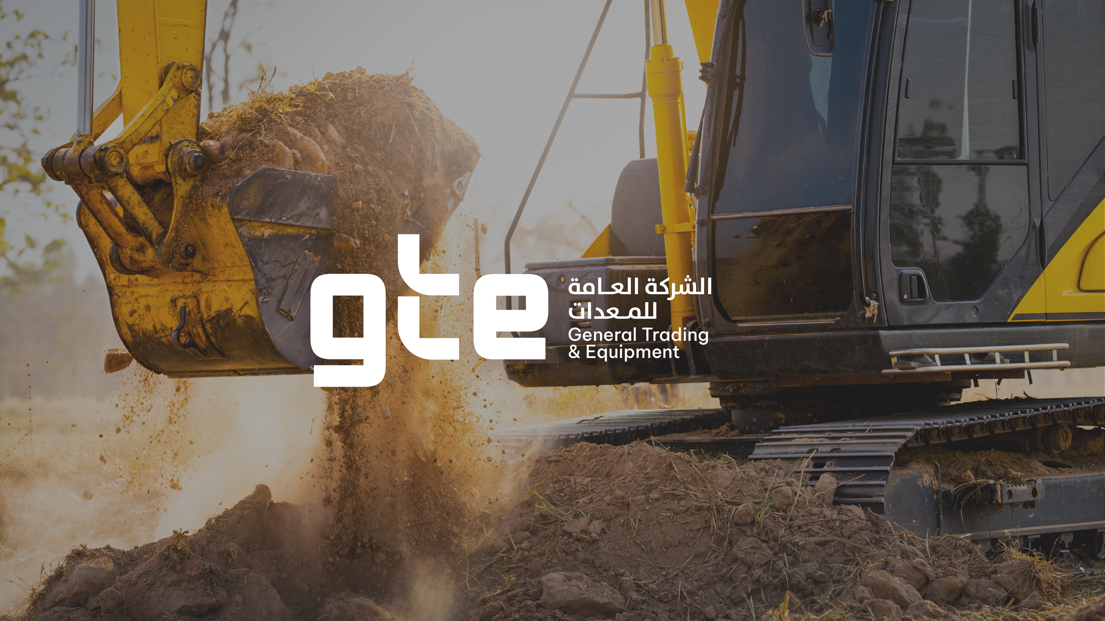
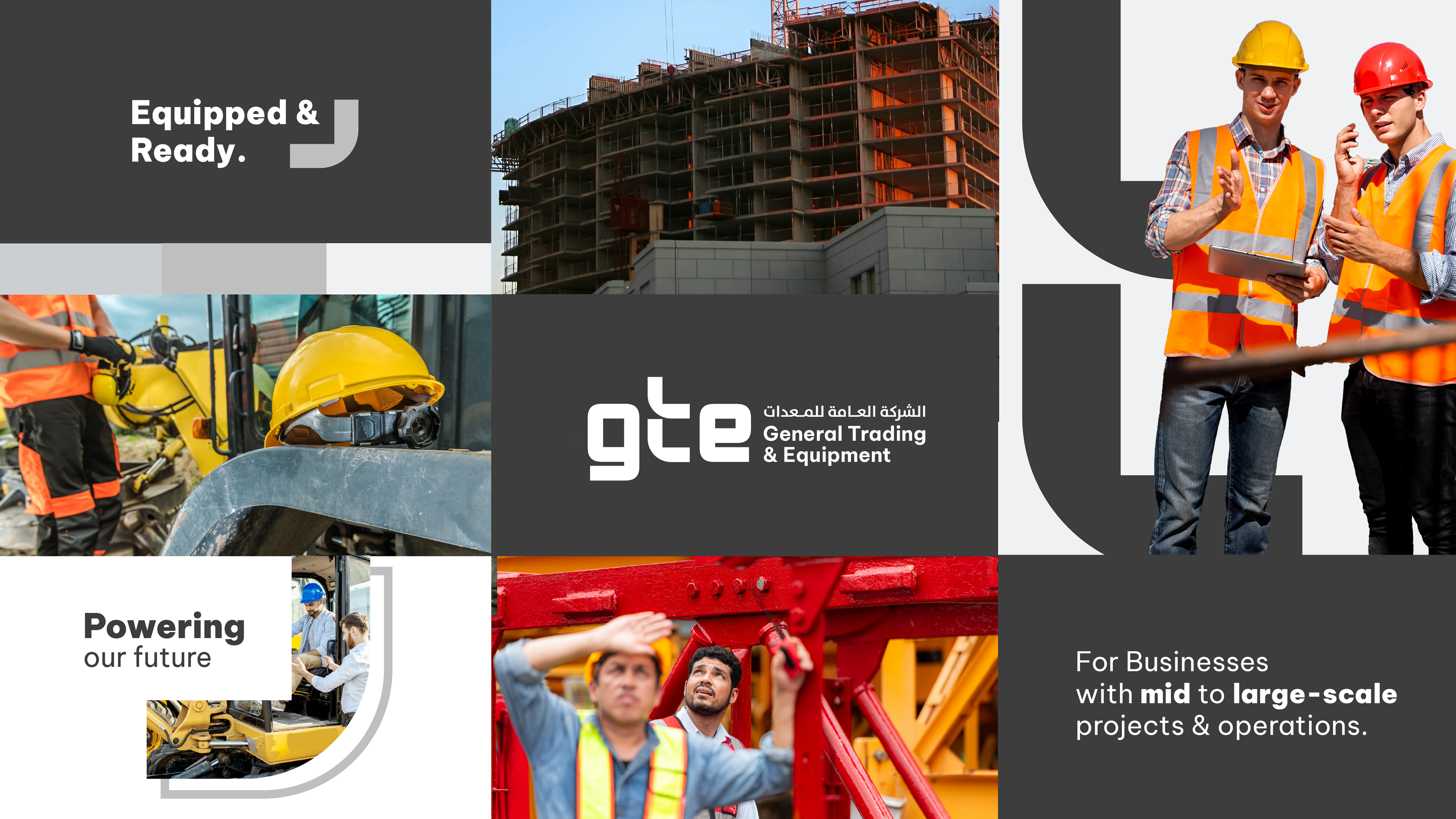
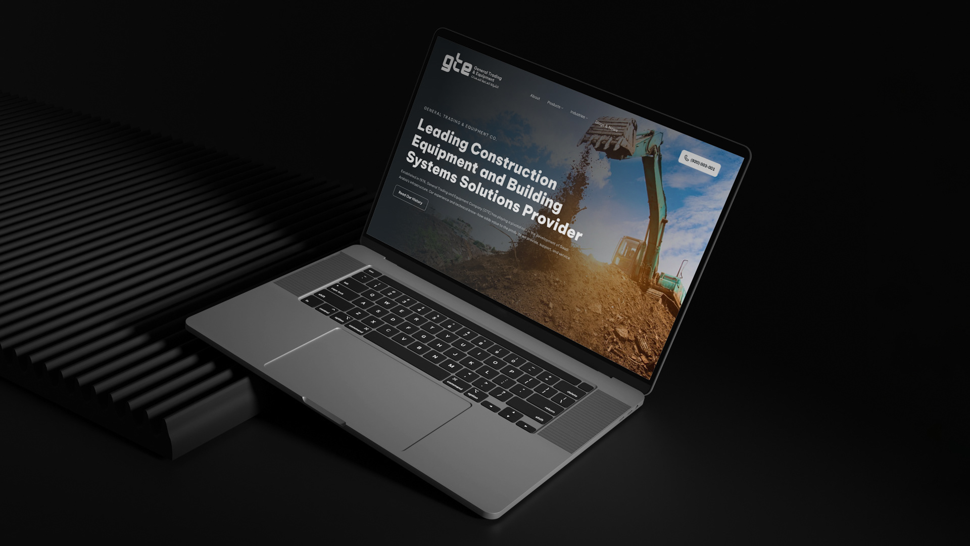
General Trading & Equipment Company (GTE) has been a trusted partner in Saudi Arabia’s construction and industrial sectors since 1976, providing world‑class equipment, tailored solutions, and dedicated after‑sales support.
Human Centered
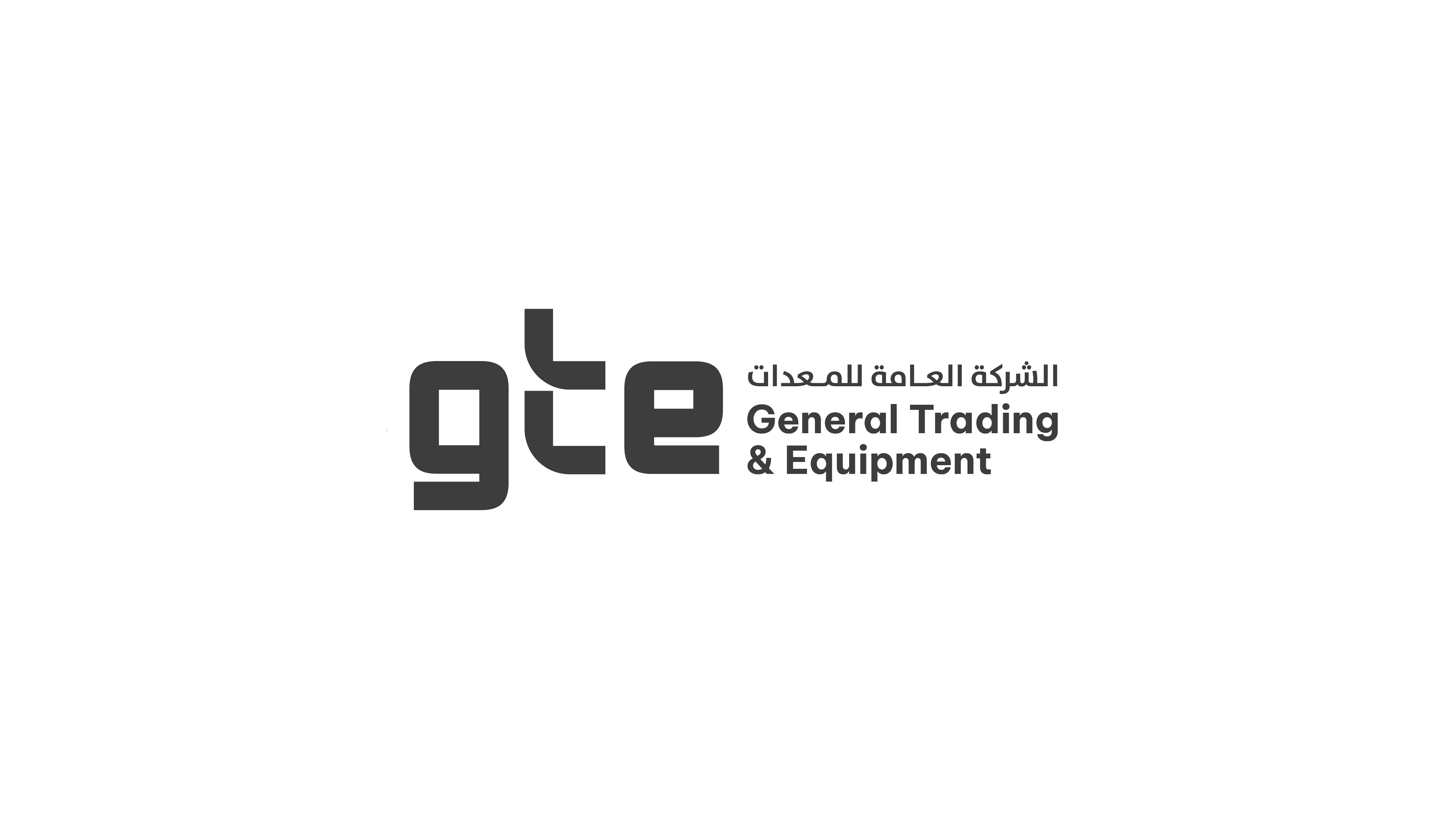
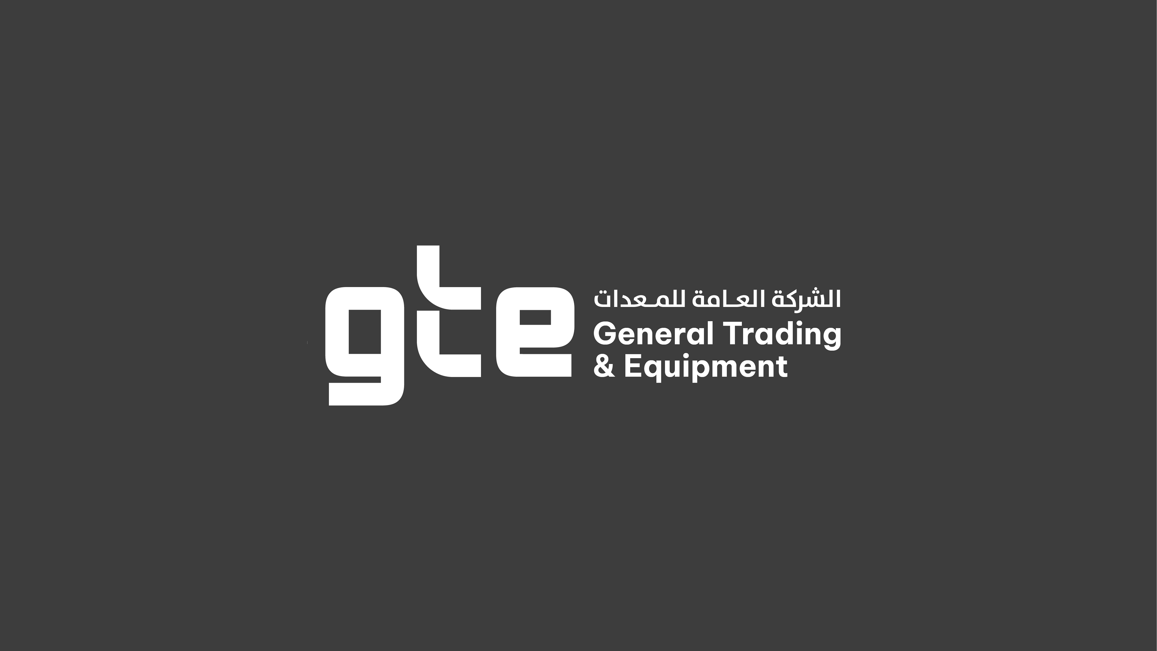
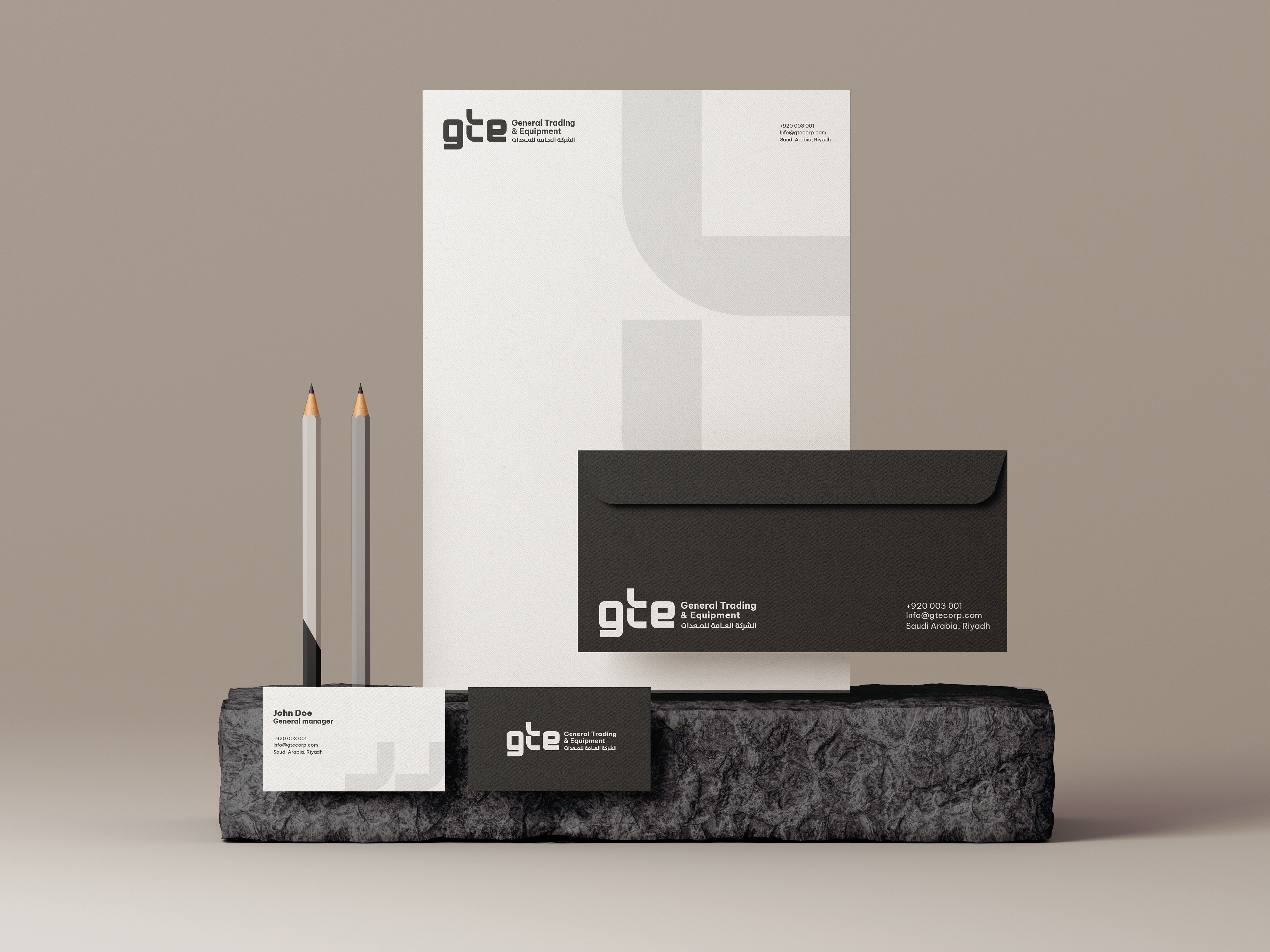
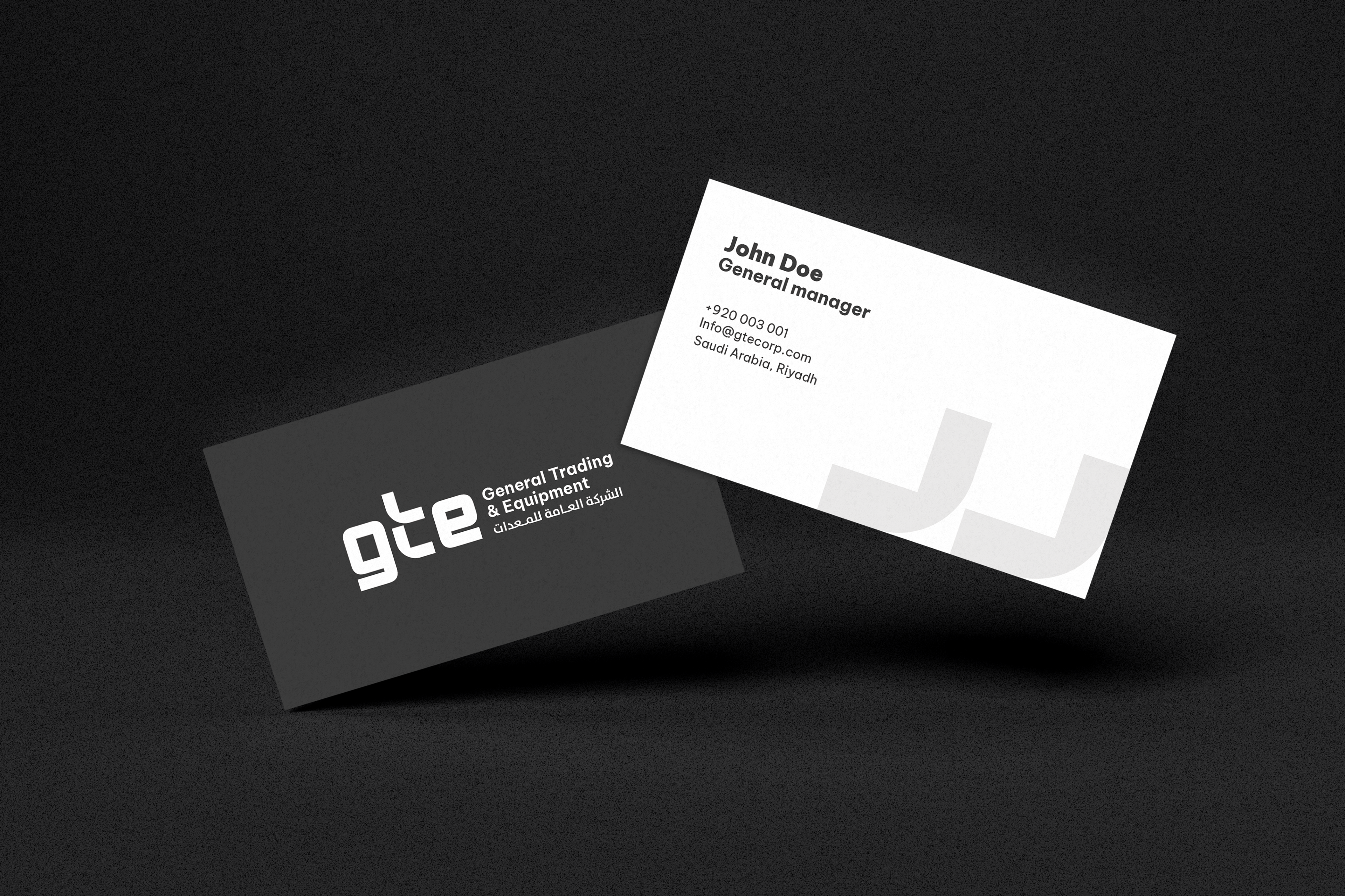
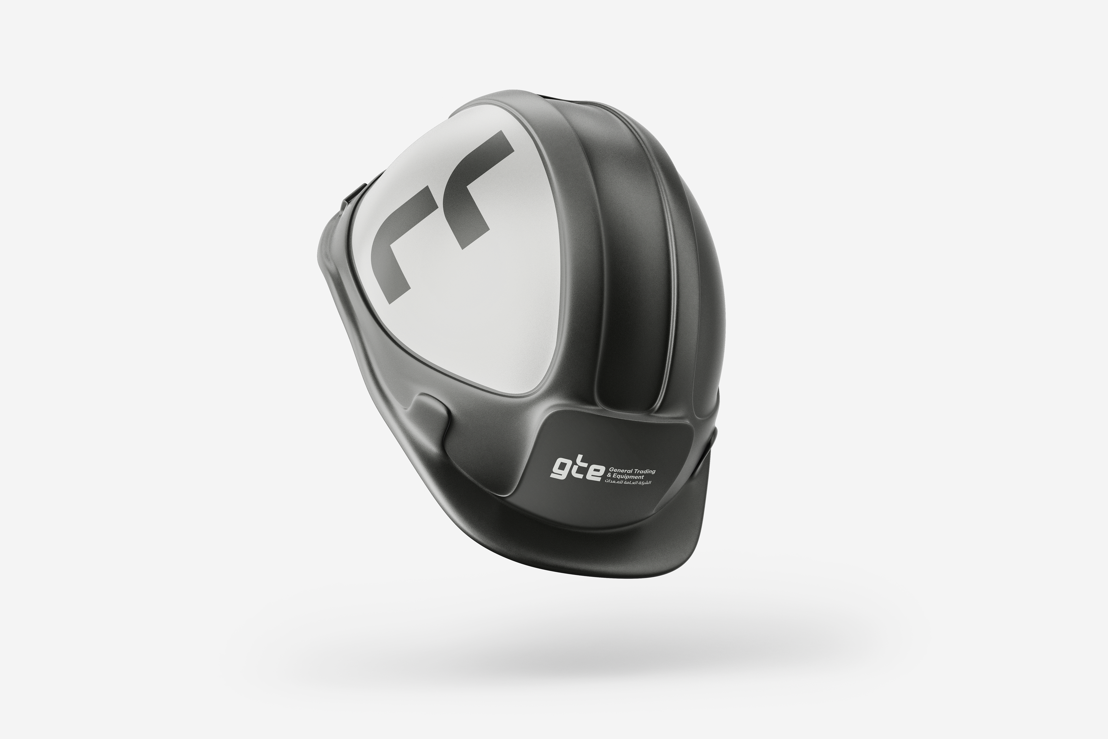
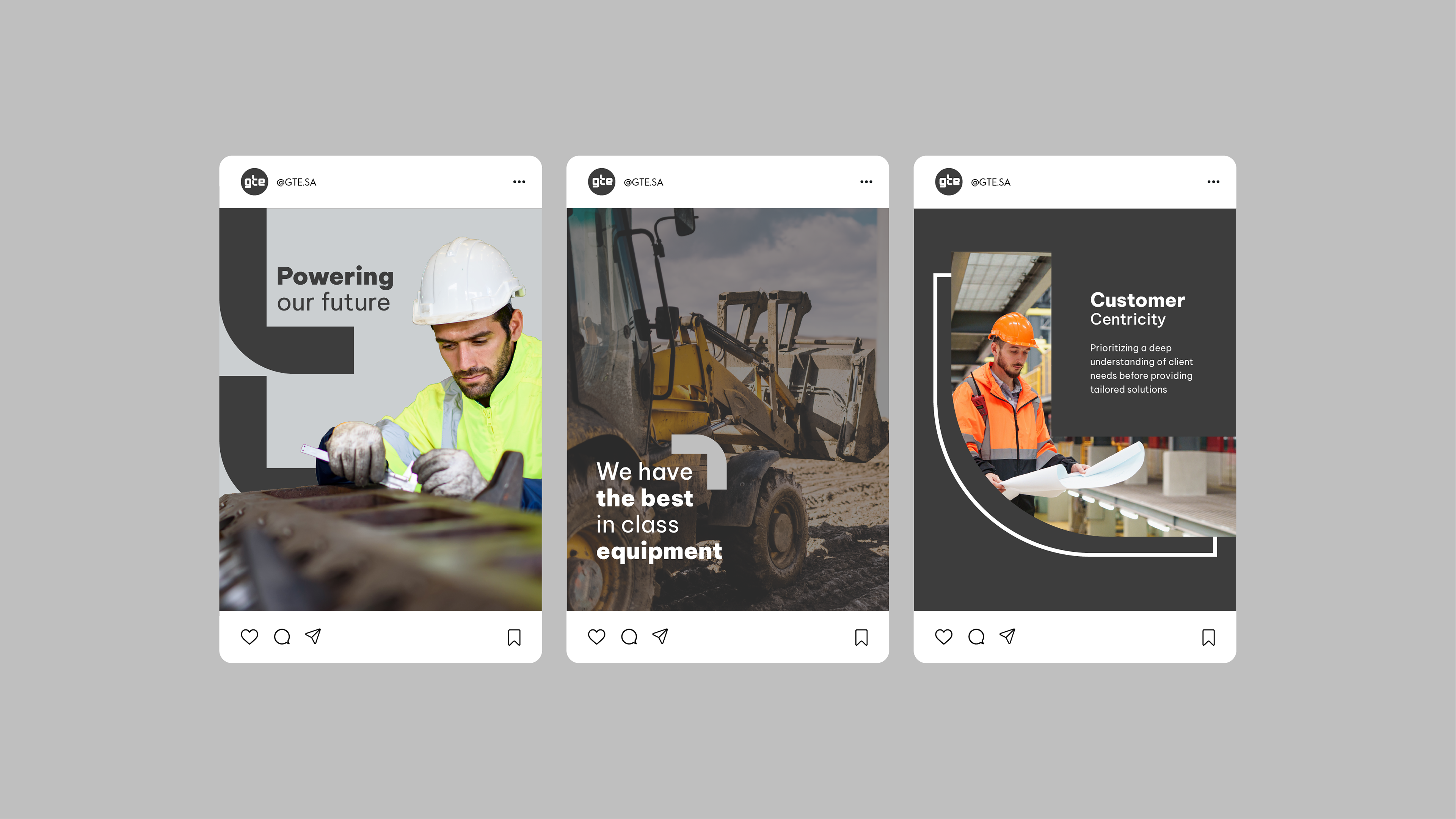
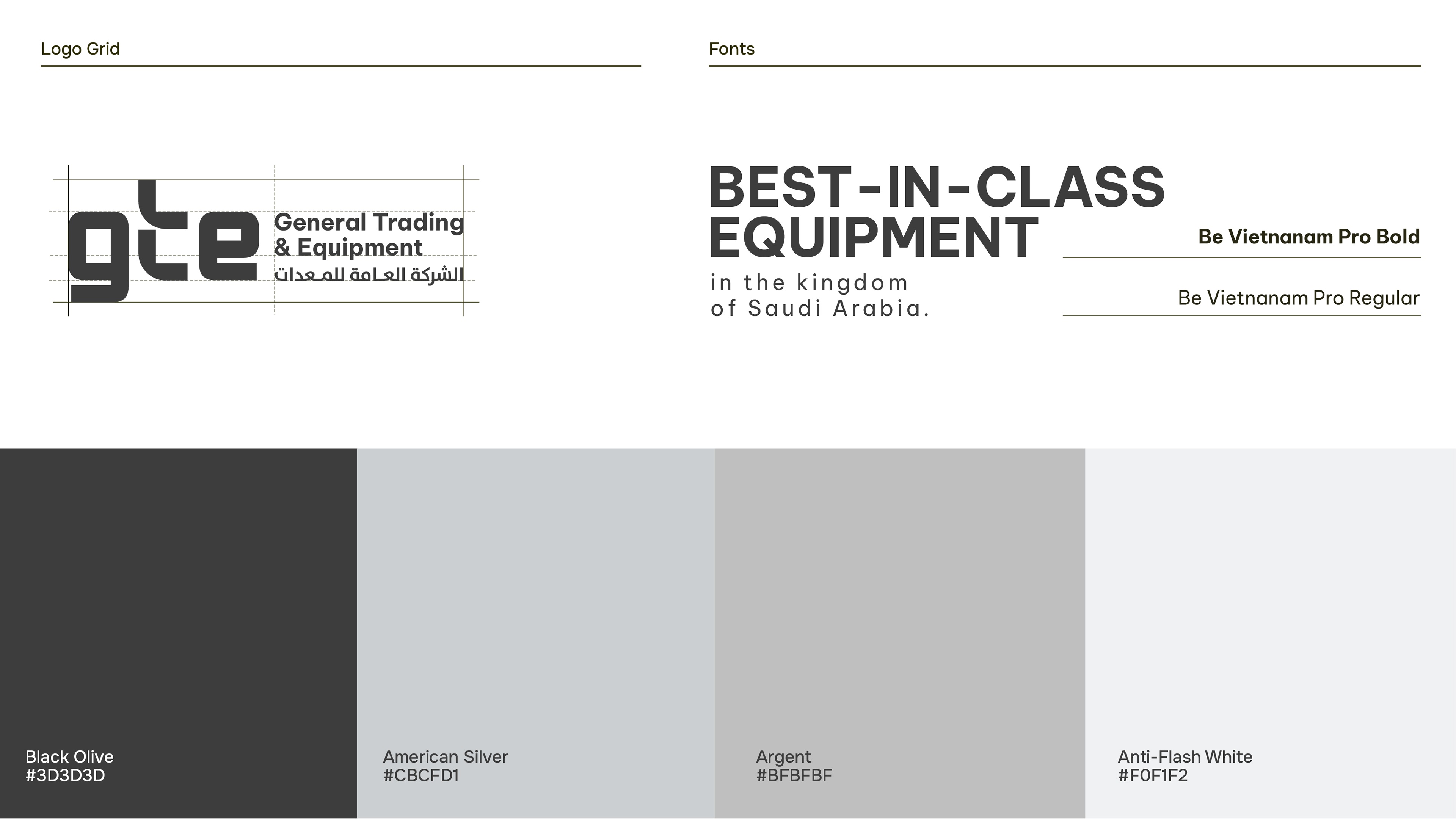
This identity uplift was one of the logo concepts explored for GTE, reflecting a strong focus on customer‑centricity. Lowercase letters were used to convey approachability and humility, while the letter “t” was split into two elements to symbolize the bridge between GTE and its clients — a connection that drives collaboration and trust. These “t” elements were also incorporated as recurring visual motifs throughout the identity. The sober, neutral grey‑focused color palette reinforced a professional and understated presence, in line with GTE’s heritage of reliability and expert service.
This project was accomplished during my employment at Spearhead Marketing &
Communications s.a.l. where I worked as a Graphic designer.
Communications s.a.l. where I worked as a Graphic designer.